Appearance
Widget catalog
QtEDM supports the complete MEDM widget set plus QtEDM-specific extensions. The sections below expand the brief object list into a practical reference: what each widget is for, the properties that matter most, and a representative screenshot.
The screenshots in this section were captured from dedicated documentation ADL example files in docs/images/adl. Most are rendered in EDIT mode; monitor examples that need live state coloring may be captured in EXECUTE mode using local soft-PV fixtures. They are intended to show geometry, styling, labeling, and available variants in a reproducible way.
Common Widget Concepts
- Geometry and stacking – Every widget has an ADL object rectangle. In EDIT mode this rectangle controls selection, resizing, and stacking order.
- Channels – Monitor widgets subscribe to one or more PVs. Controller widgets write to PVs. Graphics widgets can also use channels for dynamic color and visibility. QtEDM expression channels can additionally publish process-local soft PVs that other widgets consume by name.
- Dynamic attributes – Many widgets support alarm-sensitive colors, discrete color rules, and visibility driven by a PV or a calculation.
- Limits and precision – Numeric widgets can use display/alarm/control limits from the PV, or explicit values stored in the ADL.
- Macros and protocols – PV names may contain macro substitutions such as
$(P). QtEDM also acceptspva://PV prefixes when PVAccess is required. - Audit logging – When logging is enabled, built-in controller, plugin-provider, and snapshot-restore writes are recorded in the audit log.
Graphics: Rectangle, Oval, Arc, Line, Polyline, Polygon, Text, Image, Composite
Monitors: Text Monitor, Expression Channel, Bar Monitor, Thermometer, Byte Monitor, LED Monitor, Multi-State Symbol, Heatmap, PV Table, Waveform Table, Waterfall Plot, NTNDArray Image, Scale Monitor, Meter, Strip Chart, Archive Plot, Cartesian Plot
Containers: Tabbed / Stacked Display
Controllers: Text Entry, Text Area, Slider, Wheel Switch, Choice Button, Menu, Message Button, Toggle, Spin Box, Related Display, Setpoint Control, Shell Command
Graphics
Rectangle
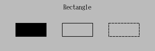
Rectangle examples showing filled, outlined, dashed, and dynamically visible variants.
Rectangles are the basic building block for panels, frames, alarm tiles, background fills, and simple status regions. In EXECUTE mode they are monitor-only; any behavior comes from dynamic color or visibility rules.
- Configure: Fill or outline, line width, line style, and foreground color.
- Use when: You need borders, grouping panels, color blocks, or a simple dynamic alarm indicator.
- Dynamic support: Color and visibility can follow alarm state, discrete PV values, or a visibility calculation.
Oval

Oval examples showing circles, stretched ellipses, and outline versus filled styles.
Ovals provide circular or elliptical graphics with the same styling model as rectangles. They are commonly used for lamps, indicator bodies, and schematic symbols that should respond to process state.
- Configure: Fill, outline width, dash style, and color.
- Use when: A round or elliptical symbol reads more clearly than a rectangular region.
- Dynamic support: Alarm/discrete color and visibility handling matches the other graphic primitives.
Arc

Arc examples covering open arcs, pie-slice fills, angle ranges, and dynamic variants.
Arcs draw partial ellipses. They can be open outlines or filled wedge-style shapes and are useful for gauges, directional annotations, and process diagrams that need something more specific than a full oval.
- Configure: Begin angle, path angle, fill mode, line width, and line style.
- Use when: You need sweep indicators, partial rings, or filled sectors.
- Dynamic support: The same color and visibility rules available to other graphic widgets also apply here.
Line

The documentation example shows straight line segments with default and dashed styles.
Use a Line when you need a straight connection segment, pointer, or border detail. A simple line is the two-point case of the polyline data model, so line and polyline styling stay consistent.
- Configure: Endpoints, line width, dash style, and arrow decorations.
- Use when: You need simple directional marks, separators, or wiring runs on a schematic.
- Dynamic support: Color and visibility can still be driven by PV state.
Polyline

The documentation example shows multi-segment polyline paths with default and dashed styles.
Polylines are connected line segments with arbitrarily many vertices. They are the right choice for piping runs, beam lines, and other paths that must bend without becoming filled areas.
- Configure: A vertex list, line width, dash style, and optional arrow heads.
- Use when: The path is not straight but should remain an open line rather than a closed polygon.
- Edit behavior: In EDIT mode individual vertices can be repositioned to reshape the path.
Polygon

Polygon examples showing filled and outlined multi-sided shapes across several vertex layouts.
Polygons represent closed multi-sided shapes. They are useful for arrows, custom equipment outlines, filled regions with irregular boundaries, and symbols that cannot be expressed as rectangles or ovals.
- Configure: Vertex list, fill mode, line width, line style, and color.
- Use when: You need a closed custom shape with either fill or outline rendering.
- Dynamic support: Visibility and color rules work the same way as for the other graphic primitives.
Text

Static text examples covering alignment, font sizes, labels, and decorative uses.
Text widgets provide static labels, titles, engineering notes, and screen annotations. They are not tied to PV updates and are intended for fixed wording that helps operators interpret the rest of the display.
- Configure: String content, alignment, color, and font sizing through the display font model.
- Use when: You need headings, units, labels, instructions, or other non-changing text.
- Tip: Static text is often paired with monitor widgets so the label remains stable while the readback changes.
Image

Image examples showing file-backed graphics, scaling, and animated/static image usage.
The Image widget displays file-backed graphics such as GIFs and other Qt image formats. It is useful for logos, equipment symbols, and any case where a drawn primitive would be too limited.
- Configure: Image file name, image type, optional dynamic visibility, and optional calculation support.
- Use when: A raster image or animated GIF communicates state more effectively than basic shapes.
- Practical note: Keep referenced image files on the display path or use an explicit file path so operators see the same asset everywhere.
Composite

The graphics example includes a composite containing child widgets that move and render as one object.
A Composite groups multiple child widgets into a single higher-level object. This is useful when a display repeatedly reuses the same local assembly of labels, indicators, and controls.
- Configure: Composite bounds, optional dynamic attributes, and the child widget list.
- Use when: Several widgets should move, copy, stack, or be shown/hidden together.
- Layering note: QtEDM preserves each composite's internal child stacking while also treating the composite itself as one top-level object.
Monitors
Text Monitor

Text Monitor examples showing numeric formatting, string readback, alignment, and alarm-driven color changes.
Text Monitor is the standard readback widget for scalar or string PVs. It displays the current value as text and can format the value for operator readability without allowing writes.
- Configure: Channel, display format, alignment, foreground/background colors, and optional limits handling.
- Use when: The exact PV value matters more than a graphical metaphor.
- Runtime behavior: Text and color update as new monitor events arrive; no operator interaction is accepted.
Expression Channel
Expression Channel is a QtEDM-only logical monitor widget that evaluates an EPICS calc expression over up to four input channels and publishes the result as a process-local soft PV. In EDIT mode it appears as a compact labeled rectangle so it can be selected and configured. In EXECUTE mode it becomes invisible and runs only as a calculation/publishing node.
- Configure: Variable name, calc expression, Channel A through Channel D, initial value, event signal mode, foreground/background colors, and precision.
- Use when: You need a local derived value, threshold signal, fan-out source, or chained calculation inside QtEDM without adding IOC-side logic.
- Runtime behavior: On execute start QtEDM publishes the initial value, subscribes to the input channels, evaluates the calc expression with the built-in EPICS calc engine, and republishes results according to the selected event signal mode.
- Consumption model: Other widgets subscribe by using the expression channel's
variablename as their normal channel name. Ifvariableis left blank, QtEDM auto-generates a private name suitable for internal logic but not for convenient manual subscription.
Bar Monitor

Bar Monitor examples covering horizontal and vertical bars, different scales, and color modes.
Bar Monitor turns a scalar PV into a filled bar graph. It is one of the clearest ways to show level, percentage, position, or any value that should be interpreted relative to a range.
- Configure: Orientation, fill direction, colors, labels, and operating limits.
- Use when: Operators should judge magnitude at a glance rather than read precise numbers.
- Runtime behavior: The filled region follows the monitored value but the widget remains read-only.
Thermometer

Thermometer examples showing vertical fill, value overlays, and several limit configurations.
Thermometer is a QtEDM-only monitor widget that presents a scalar PV as a thermometer-style fill. It provides a more literal physical metaphor than a generic bar graph.
- Configure: Value channel, visual styling, displayed value text, and static or PV-sourced limits.
- Use when: A long vertical readout matches the process concept better than a bar or text field.
- Compatibility: Thermometer is a QtEDM extension and is not backward compatible with MEDM.
Byte Monitor

Byte Monitor examples displaying individual bits and grouped status patterns from integer PVs.
Byte Monitor breaks an integer PV into visible bit states. It is especially useful for status words, interlocks, mode fields, and hardware flags where individual bits are meaningful to operators.
- Configure: Channel, bit orientation, start/end bit range, and colors.
- Use when: The operator needs to inspect multiple boolean states encoded inside one PV.
- Runtime behavior: Bit cells update independently as the underlying integer value changes.
LED Monitor

LED Monitor examples showing a static lamp, an alarm-driven indicator, and a discrete multi-state indicator.
LED Monitor is a QtEDM-only compact status lamp. It is intended for cases where a single small shape should communicate connection, alarm state, or a discrete integer state more directly than a full bar, meter, or layered graphic composite.
- Configure: Channel, color mode, shape, bezel, foreground/background colors, on/off/undefined colors, state count, and per-state colors.
- Use when: You need a compact lamp for binary status, alarm indication, or MBBI-style multi-state readback.
- Runtime behavior: In EXECUTE mode the LED can hold a static color, follow EPICS alarm severity, or map integer values to up to 16 configured colors.
| Property | Purpose |
|---|---|
channel | The PV or soft-PV driving the LED state. |
colorMode | static, alarm, or discrete. |
shape | circle, square, or rounded_square. |
bezel | Enables the lamp-style raised ring and highlight. |
onColor / offColor | Convenience colors for binary-style usage and edit-mode previews. |
undefinedColor | Fallback color for disconnects or out-of-range discrete states. |
stateCount / stateColorN | Configures the discrete color table for integer states 0 through 15. |
visibilityMode, visibilityCalc, visibility channels | Optional hide/show behavior matching the other dynamic widgets. |
text
led_monitor {
  object {
    x=60
    y=110
    width=24
    height=24
  }
  monitor {
    chan="device:state"
    clr=25
    bclr=4
  }
  colorMode="discrete"
  shape="rounded_square"
  bezel=1
  stateCount=4
  stateColor0=12
  stateColor1=15
  stateColor2=33
  stateColor3=20
  undefinedColor=7
}
Multi-State Symbol
Multi-State Symbol is a QtEDM extension stored as qtedm_symbol. It maps numeric values or inclusive ranges to a color, label, and optional image. Undefined values and disconnected channels remain visibly hatched, while active alarms add a severity-colored border.
- Configure: Use the LED resource palette for the channel and colors, then choose QtEDM Extension Properties... from the edit context menu for ranges, labels, and image paths.
- Compatibility: The object is a separate QtEDM extension and never changes the meaning of a MEDM object.
Tabbed Display
Tabbed Display is a QtEDM extension stored as qtedm_tabbed_display. Each page has a stable ID, label, file-backed child ADL, page macros, and a keepAlive policy. Page macros override inherited parent macros.
- Configure: Create the object from the Containers section, then double-click it in EDIT mode to edit its page table.
- Runtime behavior: The active child is loaded on demand. Inactive pages are destroyed and unsubscribe by default;
keepAlive=trueretains a loaded page. Ctrl+PageUp and Ctrl+PageDown navigate pages. - Stacked mode: Set
mode="stacked"to hide the tab bar while retaining keyboard or programmatic page selection. - Diagnostics: Missing child files and recursive references produce visible page errors.
- Compatibility: Child files remain ordinary ADLs. The container block is a QtEDM-only extension and does not reinterpret MEDM objects.
Heatmap

Heatmap example showing the widget layout with title area, plot area, and optional profile regions.
Heatmap is a QtEDM-only 2-D array monitor. It renders a waveform or array PV as a color image and can derive the X and Y dimensions from either fixed values or additional PVs.
- Configure: Data PV, X/Y dimensions, dimension source, color map, flips, rotation, aspect ratio, and optional top/right profiles.
- Use when: A 2-D image or matrix communicates structure that would be lost in a 1-D plot.
- Runtime behavior: In EXECUTE mode QtEDM supports zooming, panning, and profile displays; MEDM does not support this widget.
PV Table
PV Table is a QtEDM-only read-only monitor for a small list of related PVs. Each configured row subscribes independently and can show the row label, PV name, current value, engineering units, and alarm severity in a single compact table.
- Configure: Row labels and channels, static or alarm color mode, header visibility, and the displayed column set.
- Use when: Operators need to compare several scalar, enum, or string PVs without building separate text monitors for each one.
- Runtime behavior: Rows update independently. Alarm color mode applies each row's alarm severity to its displayed text while disconnected rows remain visible.
- Compatibility: PV Table is a QtEDM ADL extension and is not backward compatible with MEDM.
| Property | Description |
|---|---|
columns | Comma-separated subset of label, pv, value, units, and severity. |
colorMode | static or alarm foreground coloring. |
showHeaders | Shows or hides the table column headers. |
fontSize | Manual table font size using MEDM legacy font-size units. In alias font mode, QtEDM uses the nearest larger MEDM alias when available and falls back to a scalable font for larger requested sizes. |
row | One table row with a label and monitored chan. |
Example ADL fragment:
text
pv_table {
  object { x=40 y=80 width=620 height=160 }
  "basic attribute" {
    clr=14
    bclr=4
  }
  colorMode="alarm"
  showHeaders=1
  fontSize=12
  columns="label,pv,value,units,severity"
  row {
    label="Beam Current"
    chan="BPM:CURRENT"
  }
  row {
    label="Mode"
    chan="BPM:MODE"
  }
}
Waveform Table
Waveform Table is a QtEDM-only read-only table monitor for a single waveform or array PV. It is intended for exact sample inspection: operators can see the current element values, indexes, connection state, received length, and alarm-driven foreground color without turning the waveform into a plot.
- Configure: Channel, static or alarm color mode, header visibility, row/column/grid layout, column count, maximum displayed elements, zero- or one-based indexes, value format, and char waveform display mode.
- Use when: The individual sample values matter more than waveform shape, or when a char waveform should be inspected as text, ASCII cells, byte values, or numeric byte values.
- Runtime behavior: Numeric waveforms are displayed as sample cells; enum values use enum labels when available; string PVs display as text; char arrays can display as one string or as per-byte cells.
- Dynamic support: Waveform Table supports static and alarm color mode. MEDM-style dynamic visibility blocks are not implemented for this widget;
wave_tabledynamic attribute blocks are ignored.
| Property | Description |
|---|---|
chan | Waveform, array, or scalar fallback PV to monitor. |
layout | grid, row, or column sample arrangement. |
columns | Grid column count. Column layout always shows Index and Value columns. |
fontSize | Manual table font size using MEDM legacy font-size units. In alias font mode, QtEDM uses the nearest larger MEDM alias when available and falls back to a scalable font for larger requested sizes. |
maxElements | Maximum displayed samples. A value of zero allows the runtime default limit. |
indexBase | Index labels start at zero or one. |
valueFormat | default, fixed, scientific, hex, or engineering numeric formatting. |
charMode | string, bytes, ascii, or numeric display for char waveforms. |
Example ADL fragment:
text
wave_table {
  object { x=40 y=80 width=520 height=220 }
  "basic attribute" {
    clr=14
    bclr=4
  }
  chan="BPM:WAVEFORM"
  colorMode="alarm"
  showHeaders=1
  fontSize=12
  layout="grid"
  columns=8
  maxElements=256
  indexBase=0
  valueFormat="default"
  charMode="string"
}
Waterfall Plot
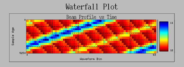
Waterfall Plot connected to a waveform PV, showing successive buffered samples rendered as a scrolling intensity image with a legend.
Waterfall Plot is a QtEDM-only monitor for waveform-versus-time data. It sits between Cartesian Plot, which shows the current waveform as traces, and Heatmap, which renders a single 2-D array. Each new waveform becomes one time slice in the rolling buffer.
- Configure: Data, count, trigger, and erase PVs; history depth; scroll direction; color map; intensity scaling; labels; legend; grid; and time units.
- Use when: Operators need to see how a profile, spectrum, or other 1-D distribution evolves over time.
- QtEDM additions: EXECUTE mode supports wheel zoom on the time axis, drag pan while zoomed, hover readback, and export of images or buffered waveform data.
| Property | Description |
|---|---|
dataChannel | Waveform PV. Each monitor update adds one sample to the waterfall. |
countChannel | Optional PV supplying the active waveform length when the array is only partially populated. |
triggerChannel | Optional PV used to trigger sampling of the most recent waveform update. |
eraseChannel | Optional PV used to clear the rolling buffer when the configured erase transition occurs. |
eraseMode | Controls whether a zero or non-zero transition clears the buffer. |
title, xLabel, yLabel | Plot title and axis labels. |
historyCount | Number of waveform samples retained in the rolling buffer. |
scrollDirection | Chooses where new samples appear: top, bottom, left, or right. |
colorMap, invertGreyscale | Intensity palette selection, reusing the Heatmap color maps. |
intensityScale, intensityMin, intensityMax | Auto, manual, or logarithmic intensity scaling for the image and legend. |
showLegend, showGrid | Optional legend bar and faint axis grid overlay. |
samplePeriod, units | Optional fixed sample spacing used for time-axis labeling and data export when timestamps are not available. |
foreground, background | Colors used for labels, axes, and the plot background. |
Example ADL fragment:
text
waterfall_plot {
  object { x=40 y=40 width=320 height=220 }
  plotcom {
    title="Beam Profile vs Time"
    xlabel="Position (mm)"
    ylabel="Time (s)"
    clr=14
    bclr=0
  }
  data { chan="BPM:WAVEFORM" }
  count { chan="BPM:NUSE" }
  trigger { chan="BPM:TRIG" }
  erase { chan="BPM:ERASE" mode="ifnotzero" }
  historyCount=200
  scrollDirection="topToBottom"
  colorMap="rainbow"
  intensityScale="auto"
  showLegend=1
  showGrid=0
  samplePeriod=0
  units="seconds"
}
Right-clicking a Waterfall Plot in EXECUTE mode adds Save Image..., Save Data..., Clear Buffer, and Reset Zoom when zoom is active.
Scale Monitor

Scale Monitor examples showing pointer direction, labels, and mixed geometry ranging from tiny to large.
Scale Monitor is a compact analog-style readback widget combining a ruler, tick marks, and a moving indicator. It works well when a bar monitor feels too heavy but text alone is not visual enough.
- Configure: Orientation, pointer direction, labels, limits, logarithmic or linear behavior, and colors.
- Use when: You need a compact gauge that still shows position relative to a scale.
- Runtime behavior: The indicator and optional numeric text move with the monitored value.
Meter

Meter examples showing analog needle displays, scale labeling, and size-dependent layout.
Meter presents a scalar PV as an analog dial. It is useful for displays that benefit from a familiar instrument-panel look or when operators prefer to recognize direction and magnitude from needle position.
- Configure: Channel, dial range, labels, colors, and limits.
- Use when: A needle gauge is the clearest mental model for the operator community using the screen.
- Runtime behavior: The meter is monitor-only and redraws the needle as values change.
Strip Chart

Strip Chart examples showing multi-trace time histories, axes, and chart layout variations.
Strip Chart trends one or more PVs against time. It is the standard widget for short-term history, quick diagnostics, and operator displays that need to show whether a signal is stable, drifting, or oscillating.
- Configure: Trace PVs, colors, update rate, time span, trigger/erase behavior, and axis labels.
- Use when: Recent history matters more than the current value alone.
- QtEDM additions: The EXECUTE-mode context menu supports data export to SDDS or CSV.
Archive Plot
Archive Plot is a QtEDM-only historical variant of Strip Chart stored as qtedm_archive_plot. On entering EXECUTE mode it requests each configured pen's current time window from the selected archive provider and continues subscribing to the live PV.
- Configure: Use the normal Strip Chart properties for pens and time span. QtEDM Extension Properties adds the maximum historical point count and whether live samples are merged after history loads.
- Built-in provider: Set
QTEDM_ARCHIVER_URLto an EPICS Archiver Appliance retrieval root. The request is bounded by time, response size, timeout, and maximum points. - Plugin provider: Set
QTEDM_ARCHIVER_PROVIDERto a registered archive-provider ID. Empty orarchiver-applianceselects the built-in provider. - Failure behavior: A missing provider, timeout, invalid response, or empty history is shown as a plot diagnostic; live plotting continues.
Cartesian Plot
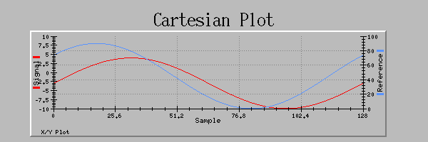
Cartesian Plot examples with multiple traces, axis combinations, scatter-style displays, and overlaid lines.
Cartesian Plot is the most flexible plotting widget in QtEDM. It can show Y-only traces against sample index or true X-Y data, and it supports multiple traces with independent axis assignments.
- Configure: X and Y PVs, trace colors, symbols, line styles, axis ranges, and labels.
- Use when: The display needs waveform, orbit, scan, or correlation data rather than simple time history.
- QtEDM additions: EXECUTE mode supports mouse-wheel zoom, drag pan, axis editing, and data export.
QtEDM-only note: Heatmaps, waterfall and archive plots, tables, symbols, tabbed displays, expression channels, and the other QtEDM extensions in this section use additional ADL block types. Legacy MEDM can continue to use the shared core subset, but it does not provide runtime support for QtEDM-only blocks. See ADL Files for the complete extension list.
Controllers
Text Entry

Text Entry examples showing editable numeric and string fields with different sizes and color modes.
Text Entry allows an operator to type a value and write it to a PV. It is the most direct control widget when precise numeric or string input matters more than constrained stepwise adjustment.
- Configure: Control PV, colors, alignment, font sizing, and limits/format behavior.
- Use when: Operators need exact typed input rather than a gesture-based control.
- Runtime behavior: The widget accepts keyboard entry only in EXECUTE mode and its writes are audit logged when logging is enabled.
Text Area
Text Area is the multi-line companion to Text Entry. It is intended for long strings and waveform-backed text, preserving embedded line breaks while still allowing operator edits in EXECUTE mode.
- Configure: Control PV, colors, format, wrap mode, scroll bars, commit behavior, tab handling, and font family.
- Use when: Operators need to read or edit longer text blocks than fit in a single-line entry widget.
- Runtime behavior: Local edits stay buffered until commit, incoming updates do not overwrite dirty text, and writes are audit logged.
- Commit behavior: Ctrl+Enter, Enter, focus-loss, and explicit context-menu commit modes are available. A dirty marker appears while local edits are pending.
- PV compatibility: Char-waveform PVs and long-string
$field access preserve multi-line text. RegularDBR_STRINGchannels fall back to single-line editing and may truncate writes at the EPICS 40-byte limit.
Slider

Slider examples showing horizontal and vertical layouts, label regions, and value ranges.
Slider provides a drag-based numeric control. It is well suited to setpoints and analog adjustments where the operator thinks in terms of moving a value within a bounded range.
- Configure: Orientation, channel, limits, labels, colors, and scale appearance.
- Use when: Smooth adjustment is more natural than typing a number.
- Runtime behavior: Interaction is live in EXECUTE mode and writes are included in audit logs.
Wheel Switch

Wheel Switch examples showing digit-by-digit editing across different widths and precisions.
Wheel Switch is a precision numeric entry widget in which each digit can be incremented or decremented independently. It is ideal for control rooms where operators want explicit control over significant digits.
- Configure: Channel, number of digits, precision, colors, and limits.
- Use when: Fine-grained numeric entry is common and accidental large jumps must be avoided.
- Runtime behavior: Digits can be stepped interactively in EXECUTE mode; writes are audit logged.
Choice Button

Choice Button examples with discrete states rendered as always-visible buttons in several styles.
Choice Button presents a small fixed set of states as visible buttons rather than hiding them in a drop-down. It is most useful for enum-like PVs where the operator should always see the available choices.
- Configure: Control PV, button labels from the underlying enum/discrete mapping, color mode, and geometry.
- Use when: Immediate visibility of the valid states matters more than conserving space.
- Runtime behavior: Clicking a choice writes the selected state and the action is audit logged.
Menu

Menu examples showing compact drop-down selection for enumerated and discrete values.
Menu is the compact alternative to Choice Button. It exposes the current value in a drop-down control and is appropriate when the state list is longer or screen real estate is limited.
- Configure: Control PV, colors, labels, and the geometry of the menu control.
- Use when: The operator needs selection capability but the display should stay visually compact.
- Runtime behavior: Selecting an item writes the new value and the write is audit logged.
Message Button
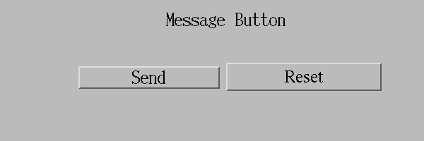
Message Button examples showing command-style controls with different labels and value mappings.
Message Button writes a predefined value when activated. It is the right widget for command actions such as Start, Stop, Reset, Open, Close, or acknowledgement operations.
- Configure: Target PV, button label, and the value written on activation.
- Use when: The control action is semantic rather than numeric and should look like a button.
- Runtime behavior: EXECUTE-mode clicks perform writes immediately and are included in the audit log.
Toggle
Toggle is a compact two-state QtEDM control stored as qtedm_toggle. It follows the current PV value, writes explicit on/off values, uses independent state labels, and can require confirmation before each write. Scalar, enum, string, and character-array targets use the same typed write path as Message Button.
Common colors, channel, and values are editable through the resource palette. State labels and confirmation are available through QtEDM Extension Properties....
Spin Box
Spin Box is a bounded numeric QtEDM control stored as qtedm_spinbox. It adds autorepeating decrement and increment buttons to the existing setpoint implementation and therefore inherits PV control limits, precision, engineering units, alarm color, connection state, access rights, and audit logging. The step size is edited with QtEDM Extension Properties....
Setpoint Control
Setpoint Control is a QtEDM-only numeric controller stored as setpoint_control. It combines an editable setpoint, optional readback, and an in/out-of-tolerance indication in one widget.
- Configure: Setpoint and readback PVs, label, numeric format, precision and limits, static/alarm color mode, absolute tolerance, and readback visibility.
- Runtime behavior: Entering a value validates numeric input and configured/channel limits before writing. Connection state, access rights, pending edits, units, and readback tolerance remain visible.
- Safety: The setpoint PV must be numeric and writable. Writes pass through observe-only policy and are audit logged.
text
setpoint_control {
  object {
    x=40 y=40 width=300 height=54
  }
  "basic attribute" {
    clr=14 bclr=4
  }
  label="Temperature"
  setpoint="HEATER:SP"
  readback="HEATER:RBV"
  colorMode="alarm"
  toleranceMode="absolute"
  tolerance=0.5
}
Related Display

Related Display examples showing buttons that open additional ADL screens with operator-friendly labels.
Related Display is a navigation widget rather than a direct PV writer. It opens one or more ADL files and can pass macro substitutions so downstream displays inherit the current device or subsystem context.
- Configure: Target display files, button label, open/replace behavior, and macro strings.
- Use when: A high-level display needs drill-down links to more detailed screens.
- Runtime behavior: Clicking opens the configured display set; no PV write is performed by the widget itself.
Shell Command
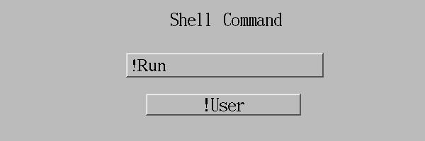
Shell Command examples showing command-launch buttons with multiple labels and action rows.
Shell Command launches external commands from a display button. It is useful for opening helper tools, diagnostic scripts, or file viewers that sit outside the ADL display itself.
- Configure: Button label plus one or more commands and arguments.
- Use when: The operator workflow needs to hand off to an external program instead of writing a PV.
- Operational note: Prefer explicit paths and predictable environment setup because commands run in the operator's local session context.